import hvplot.pandas
from bokeh.sampledata import penguins
df = penguins.data
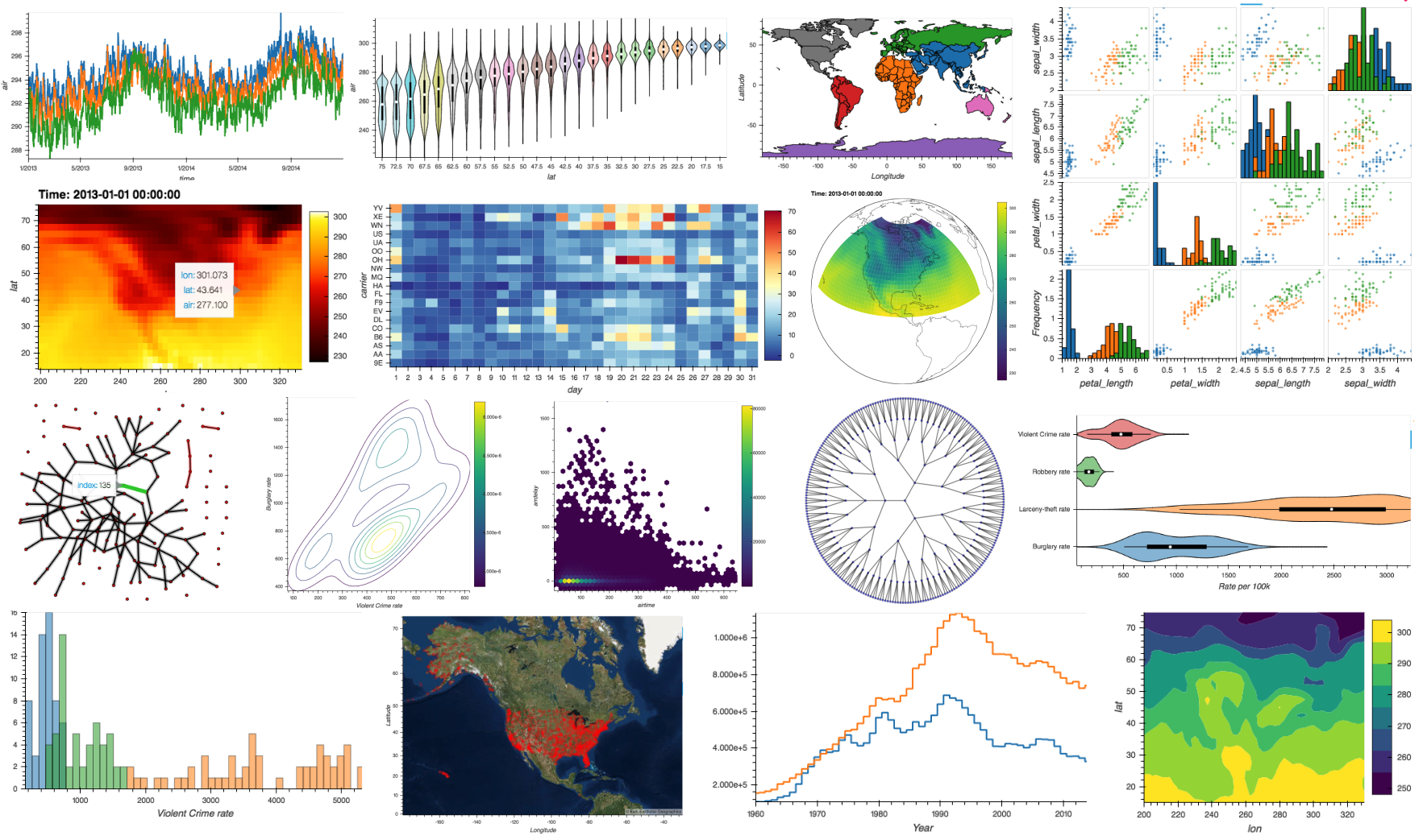
df.hvplot.scatter(x='bill_length_mm', y='bill_depth_mm', by='species')hvPlot 0.8.0 Release
release
hvplot
Release announcement for hvPlot 0.8.0

What is hvPlot?
hvPlot is an open-source library that offers powerful high-level functionality for data exploration and visualization that doesn’t require you to learn a new API. For instance, if you have a Pandas or Xarray data pipeline already, you can turn it into a simple data-exploration app by starting the pipeline with .interactive and replacing method arguments with widgets. Or you can get powerful interactive and compositional Bokeh, Plotly, or Matplotlib plots by simply replacing .plot with .hvplot. hvPlot makes all the analytical power of the HoloViz ecosystem available, using the APIs you already know.
Check out the hvPlot’s website to find out more!
New release!
We are very pleased to announce the 0.8.0 and 0.8.1 releases of hvPlot! The 0.8.0 release focused on adding a number of powerful features requested by our users, including:
- In addition to Bokeh, hvPlot now supports Matplotlib and Plotly plotting extensions, so that the results of your exploratory analysis can be used alongside highly customized plots from your favorite library.
.interactive()pipelines can now start with functions as inputs, not just from an existing data structure, so that you can make fully self-contained data apps from using hvPlot alone.- The new hvPlot Explorer is a UI component designed to easily explore data without having to write any code; just drop it in your notebook or app and start exploring!
@sophiamyang has created an awesome video that introduces you to the new features of hvPlot, check it out!
While this blog post will focus on those three big features, hvPlot 0.8 includes a number of other enhancements and bug fixes that are of almost equal importance. For a detailed list of the changes, check out the release notes for hvPlot 0.8.0 and 0.8.1.
Many, many thanks to everyone who filed issues or contributed to this release. In particular we would like to thank @jbednar, @FabianHofmann, @jomey, @ablythed, @jlstevens, @MarcSkovMadsen, @Hoxbro, @michaelaye, @MridulS, @ppwadhwa, @maximlt, @philippjfr for contributing various fixes and improvements!
If you are using conda, you can get the latest hvPlot with conda install -c pyviz hvplot , and using pip you can install it with pip install hvplot.
New plotting extensions: Matplotlib and Plotly
You may be surprised that despite its name, hvPlot is actually not a plotting library! Instead, it is a high-level interface that delegates the actual “plotting” work, i.e. how to display lines, points, etc. on a screen, to lower-level libraries. Until now, hvPlot was only able to delegate that work to Bokeh, one particular interactive plotting library. However, hvPlot happens to be built on top of HoloViews, which for years has had support for Matplotlib and Plotly as well. hvPlot now exposes those capabilities of HoloViews, which opens up new opportunities of hvPlot usage. For instance, you can now explore plots interactively using hvPlot, export them as Matplotlib figures, and then combine the output with other custom Matplotlib figures for a publication-ready workflow.
While Bokeh is still the default plotting backend of hvPlot, with the new hvplot.extension() utility you can now declare, usually at the start of a notebook, the plotting backend you would like to use.
hvplot.extension('matplotlib')Then just use hvPlot as you normally do, including optionally passing styling options that are compatible with the selected plotting backend.
scatter = df.hvplot.scatter(x='bill_length_mm', y='bill_depth_mm', by='species')
scatter.opts(fig_size=150)
Even if hvPlot allows you to customize your plots quite extensively, there are always situations when you need more! In those cases and in the spirit of the HoloViz mantra shortcuts, not dead-ends, you can get a handle on the actual plotting figure object with hvplot.render() and adapt it further to your liking.
%matplotlib inline
import matplotlib.pyplot as plt
with plt.xkcd():
fig = hvplot.render(scatter)fig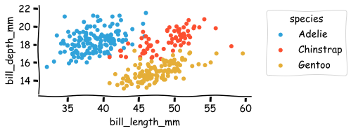
Head over to hvPlot’s site to learn more about how to manage the extensions and have a look at the Matplotlib and Plotly pages of the site to get an overview of the kind of plots you have access to now.
Powerful .interactive() pipeline
hvPlot 0.7 added an amazing new .interactive() API that is now finally being announced properly. Imagine you are trying to analyze data in a Pandas DataFrame, e.g. in a Jupyter notebook, by calling various Pandas methods to select, aggregate, or plot the data. You will often find yourself having to re-run many commands or notebook cells after changing the method parameters, either to get more insights on the data or to fine tune an algorithm. The .interactive API makes this exploration fast and interactive, giving you a Panel app directly from your data structure’s existing API!
As an example, let’s use a time series oftim stock data. In this rather simple data pipeline, we filter the time series by a time range, we upsample the filtered data to one week, and we finally plot the result as an OHLC Open-High-Low-Close (OHLC) chart:
import yfinance
df = yfinance.download("NVDA", start="2020-01-01", end="2022-04-30", progress=False)
(
df
.loc[(df.index>="2020-01-01") & (df.index<="2022-04-30")]
.resample('W').agg({'Open': 'first', 'High': 'max', 'Low': 'min', 'Close': 'last'})
.hvplot.ohlc(grid=True, title='NVDA')
)This particular plot is just one of many that we might use to understand the data, and we’d also look at filtering the data on another period and changing the resampling offset value. How this is usually achieved is either by modifying the notebook cell and re-running it, or copy/pasting its content to another cell and accumulating variations of the pipeline in the notebook.
Instead, you can now define your parameters as widgets and inject them into the pipeline, as long as you first make your pipeline interactive with .interactive(). An interactive pipeline mirrors the API of the underlying data object, which means you can use any method or operators you would normally use from the Pandas DataFrame API.
import panel as pn
# Create Panel widgets
w_resample = pn.widgets.RadioButtonGroup(options=['W', 'M'])
w_dt_range = pn.widgets.DateRangeSlider(start=df.index.min(), end=df.index.max())
# Make the pipeline interactive
dfi = df.interactive(loc='left')
# Inject the widgets in the interactive pipeline
(
dfi
.loc[(dfi.index>=w_dt_range.param.value_start) & (dfi.index<=w_dt_range.param.value_end)]
.resample(w_resample).agg({'Open': 'first', 'High': 'max', 'Low': 'min', 'Close': 'last'})
.hvplot.ohlc(grid=True, title='NVDA')
);
The pipeline output consists of the injected widgets and the normal pipeline output. Updating a widget will automatically update the output, in this case the plot. So with just a little bit of preliminary work, i.e. creating the widgets and the interactive object, you can now comfortably explore your data without writing new code for each combination.
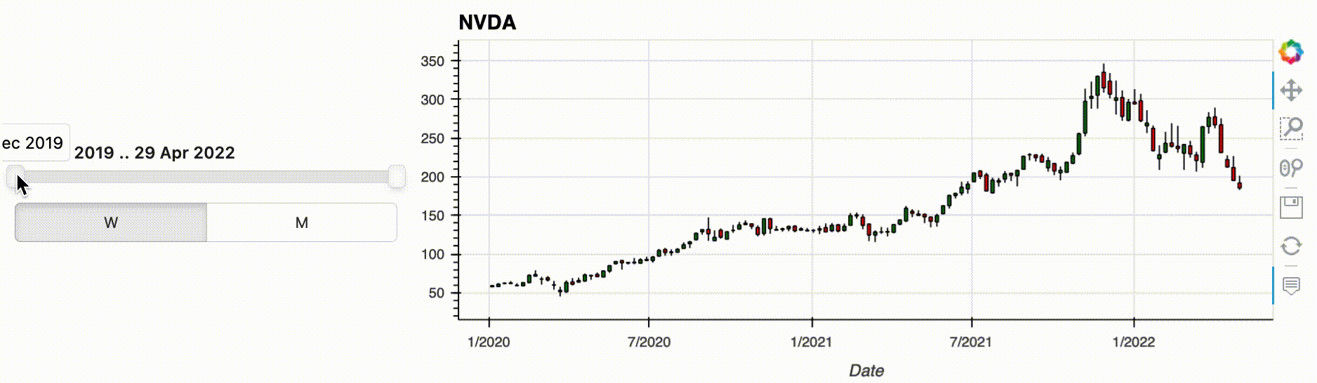
hvPlot allows you to start your pipeline from a variety of data types, including Xarray DataArrays and Datasets, and Pandas, GeoPandas, Dask and Streamz Series and DataFrames. But what if you want the user to make a selection before you have the data in one of these formats, e.g. because you are selecting between files or loading data from a database or a web API? In that case, you can use the new feature from hvPlot 0.8.0: functions can now be passed as inputs to an interactive pipeline. As long as your input function returns one of the data types supported by .interactive(), you can bind whatever arguments it has to widgets using hvplot.bind(). Calling .interactive() on the bound function then declares it as an interactive object that can be used at the start of a pipeline. In the following example we use this new feature to select the stock we want to analyze, defining an input function that will download the data from a web API.
# Create a Panel widget
w_ticker = pn.widgets.Select(name='Ticker', options=['NVDA', 'AAPL', 'IBM', 'GOOG', 'MSFT'])
# Define a loading function that returns a Pandas DataFrame
def load_stock_time_series_from_yahoo(ticker):
return yfinance.download(ticker, start="2020-01-01", end="2022-04-30", progress=False)
# Bind the function to a widget and make the bound function interactive.
dfi = hvplot.bind(load_stock_time_series_from_yahoo, w_ticker).interactive(loc='left')
(
dfi
.loc[(dfi.index>=w_dt_range.param.value_start) & (dfi.index<=w_dt_range.param.value_end)]
.resample(w_resample).agg({'Open': 'first', 'High': 'max', 'Low': 'min', 'Close': 'last'})
.hvplot.ohlc(grid=True, title=w_ticker)
);
.interactive() has a lot more to offer than what was described above, and you can check out out the documentation to learn more about it.
Introducing the Explorer user interface
Using .hvplot() is a simple and intuitive way to create plots. However when you are exploring data, you don’t always know in advance the best way to display it, or even what kind of plot would be best to visualize the data. You will very likely embark on an iterative process that requires choosing a kind of plot, setting various options, running some code, and repeating until you’re satisfied with the output and the insights you get. The hvPlot Explorer is a Graphical User Interface that allows you to easily generate customized plots, which makes it easy to explore both your data and hvPlot’s extensive API.
To create an Explorer you pass your data to the high-level hvplot.explorer function, which returns a Panel app that can be displayed in a notebook or served in a web application. On the right-hand side of this app is a preview of the plot you are building, and on the left-hand side are the various options that you can set to customize the plot.
Note that for the explorer to be displayed in a notebook, you need to load the hvPlot extension, which happens automatically when you execute import hvplot.pandas. If instead of building Bokeh plots you would rather build a Matplotlib or Plotly plot, simply run hvplot.extension('matplotlib') or hvplot.extension('matplotlib') once, before displaying the explorer.
hvexplorer = hvplot.explorer(df)
hvexplorer;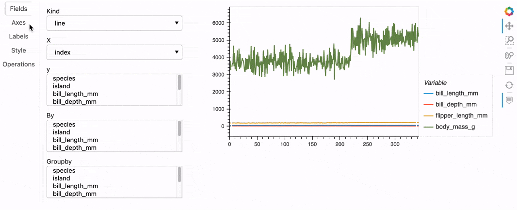
Once you’ve created a plot you like, you can then export the current state of the explorer in a few different ways. For instance, you could execute hvexplorer.plot_code() to return a code snippet that you can copy/paste in another notebook cell to reproduce that plot:
>>> hvexplorer.plot_code()
"df.hvplot(by=['species'], kind='scatter', title='Penguins', x='bill_length_mm', y=['bill_depth_mm'])"Help us!
hvPlot is an open-source project, and we are always looking for new contributors. Join the discussion on the Discourse and we would be very excited to get you started contributing! Also please get in touch with us if you work at an organization that would like to support future hvPlot development, fund new features, or set up a support contract.